Overview
Monefi was a FinTech startup in the financial comparison space - similar in concept to MoneySupermarket or Compare the Market, helping users find the best deals across financial products. I joined mid-project as the sole designer at The Sensible Group, working alongside a developer colleague, with the CEO and Marketing Director as key stakeholders.
When I arrived, the branding, IA, and site structure were already defined. Rather than treat that as a constraint, I used it as a starting point — taking what was working, stripping what wasn't, and building my own design process on top of it. The project was chaotic by nature: stakeholder direction shifted, the tech stack changed, my developer colleague went on extended sick leave. What it produced was a genuinely comprehensive design exercise — and a clear demonstration of what senior design looks like when the conditions aren't clean.
What I Inherited — and What I Added
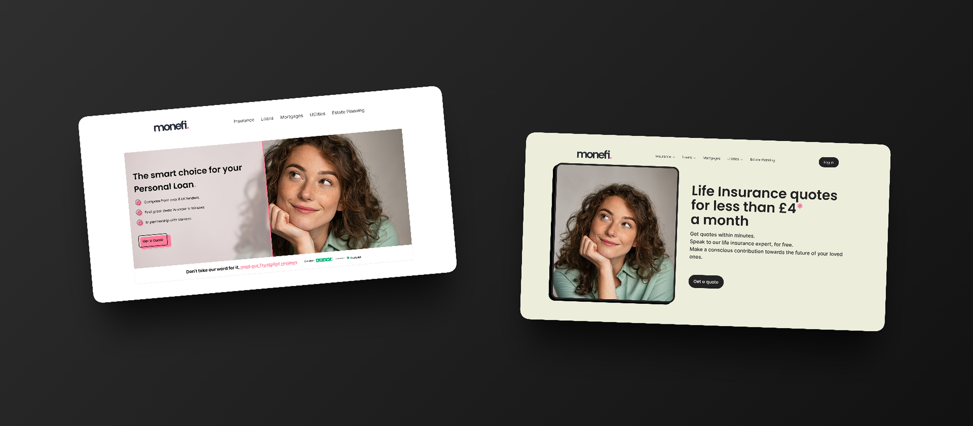
The existing work gave me a solid structural foundation: a considered colour scheme, a white-space-heavy approach that felt appropriate for a financial product, a defined IA, and consistent page structure. The colour and white space informed Direction 1. The IA and page structure would carry through to Direction 2. Either way, understanding what was worth keeping — and what wasn't — was a conscious decision, not a default.
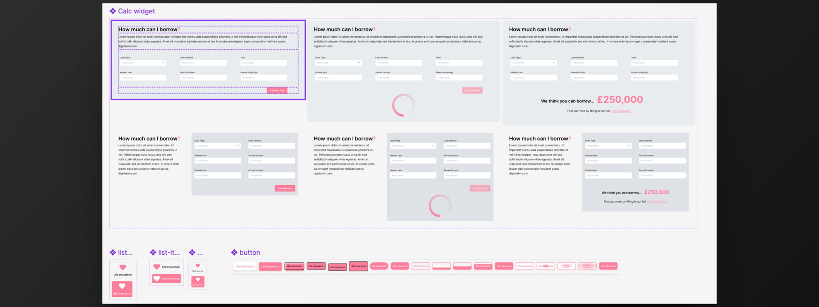
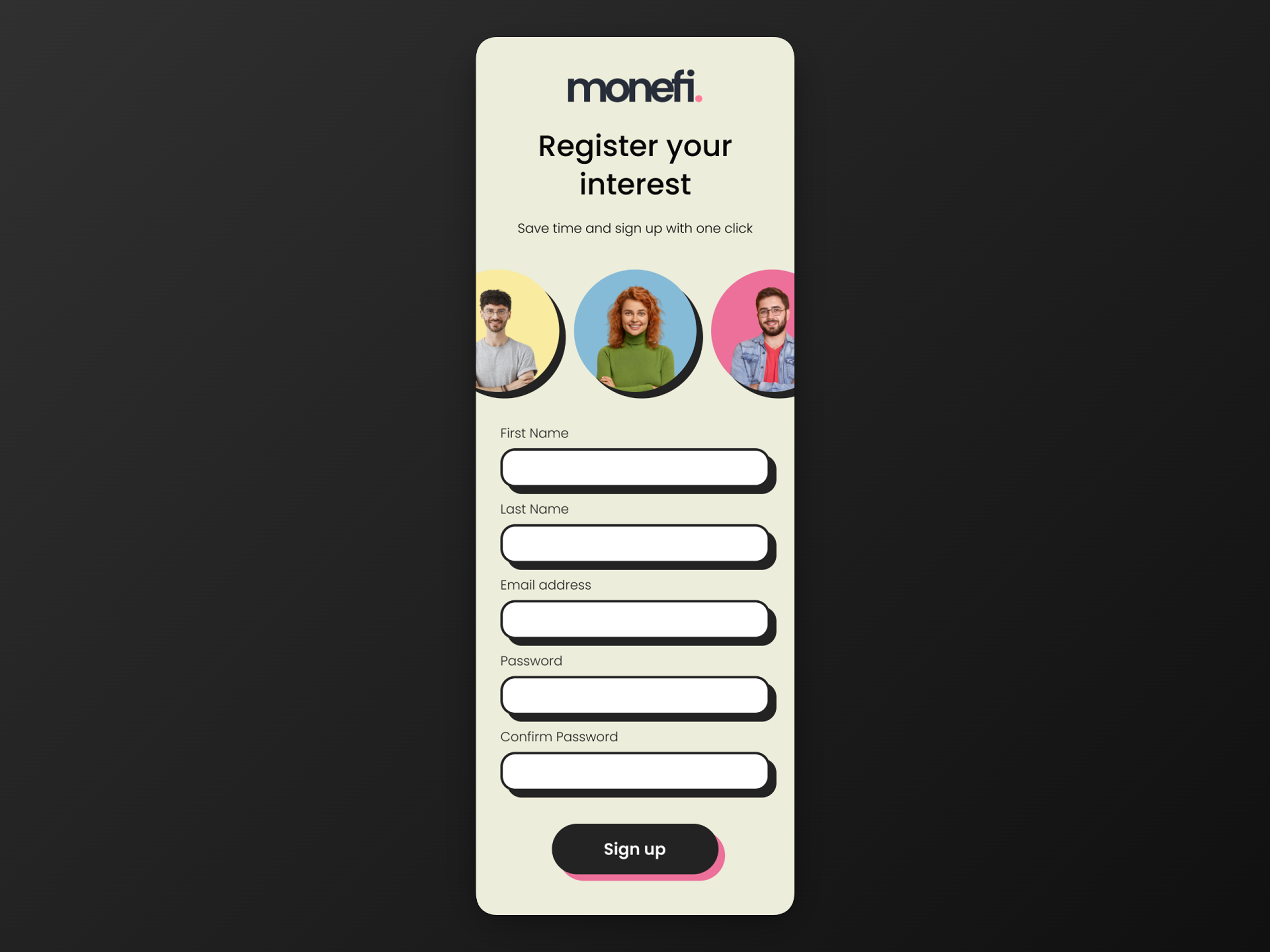
What the existing design lacked was distinctiveness. It was restrained to the point of being forgettable. I pushed the visual language forward by introducing more striking hero imagery, glassmorphism to modernise the feel of key UI surfaces, and a design systems approach that imposed rigour the project had been missing. I also built a working mortgage calculator directly in Figma using variables — an interactive prototype that functioned like the real thing without requiring a line of code, well ahead of when this kind of Figma capability became commonplace.
The result was a direction that used the same bones as what came before but felt like a different product.
The Direction Change
Despite the progress made on Direction 1, the CEO and Marketing Director decided they wanted something fundamentally different — bolder, more expressive, a bigger departure from the restrained FinTech aesthetic. At the same time, the decision was made to switch from handwritten code to WordPress with Elementor, adding a full build responsibility on top of the redesign. My developer colleague went on extended sick leave at the same point, so I absorbed the build entirely.
The direction change and the tech stack change arrived simultaneously. That's the nature of this kind of project.
Direction 2 — The Full Overhaul
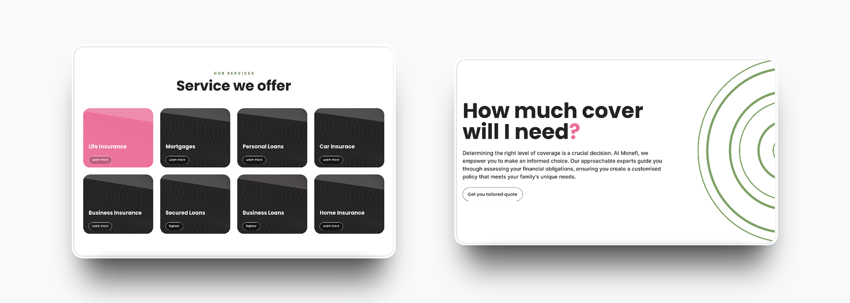
The CEO and Marketing Director wanted to move away from the restrained, glassmorphic aesthetic of Direction 1 entirely. The brief was for something louder and more commercially assertive — bold colour, expressive typography, high-energy layouts. A significant departure from everything I'd built in Direction 1.
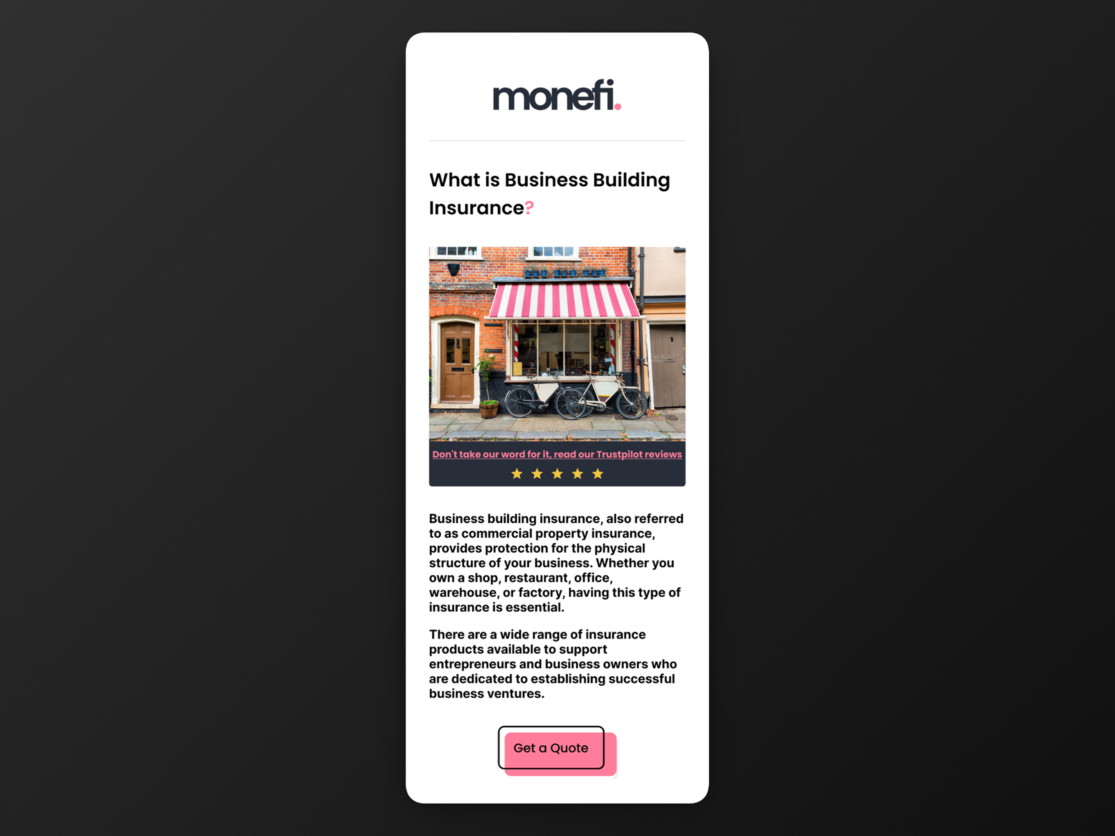
The only things that carried over were the IA and page structure — the underlying architecture of how the site was organised and how pages were laid out. The colour scheme, the white-space approach, the visual language: all of it was replaced. The result was a product that shared a skeleton with Direction 1 and nothing else.
Despite the complete visual pivot, I maintained the same component-first discipline throughout — mapping Figma components directly to Elementor blocks on a one-to-one basis, so pages could be assembled from reusable templates rather than rebuilt from scratch each time. It kept delivery moving and kept the output consistent across a site I was building entirely alone.
Outcome
Monefi launched as a live product. From the point I joined I owned the full visual design process — two distinct directions, a component system applied consistently across both, and the complete WordPress build. The company has since dissolved and the site is no longer live, but both Figma files remain as a record of the work and the decisions behind it.
Looking Back
The main thing I'd do differently is read the brief more clearly from the start. I was brought in because the CEO and Marketing Director wanted a change of direction — that was the implicit brief even if it wasn't stated outright. Instead of working within what existed and pushing it incrementally, I should have gone harder and bolder from day one. Direction 1 was a refinement when what was needed was a departure. The fact that it was rejected and a full overhaul was required afterwards confirmed that. If I'd been more decisive earlier, we'd have arrived at the right place in one step rather than two.
That instinct — to understand what a stakeholder actually needs versus what they say they need — is one of the most important skills at senior level, and it's one I've continued to develop. On subsequent projects I've pushed harder for early alignment on creative direction before committing significant build effort.
The Elementor constraint was also limiting in ways I didn't fully anticipate. The component-to-block mapping was a reasonable workaround, but it meant the design system was always fighting the grain of the tool. Given the choice again I'd push earlier for a stack the systemic approach could map to more naturally.