Overview
The Mortgage Affordability Calculator is one of the most frequently used tools in the Halifax Intermediaries broker portal - used by mortgage brokers to quickly assess how much a client can borrow before proceeding to a full application. The existing version was hosted by a third-party platform, had drifted out of alignment with the current design system, and was generating affordability results that brokers considered imprecise.
I joined the project as a Graduate Product Designer within the Homes and Mortgages team at Lloyds Banking Group. I was responsible for designing the initial prototypes from the ground up, working in regular crit sessions with a senior designer to refine them. A dedicated user researcher ran the testing sessions; I was present for all five and took detailed notes throughout. After synthesis, I produced the iterated designs that directly addressed what brokers told us.
Project Objectives
Three goals shaped the project from the outset:
- In-house hosting and analytics - moving the tool away from a third-party platform to gain control over performance data and enable future improvements through real usage analytics
- Design system alignment - the existing calculator had drifted from the current design system, creating visual inconsistency across the broker portal
- Improved accuracy of results - broker feedback indicated the question set was generating imprecise affordability figures; refining the questions was central to the brief
IA and Initial Designs
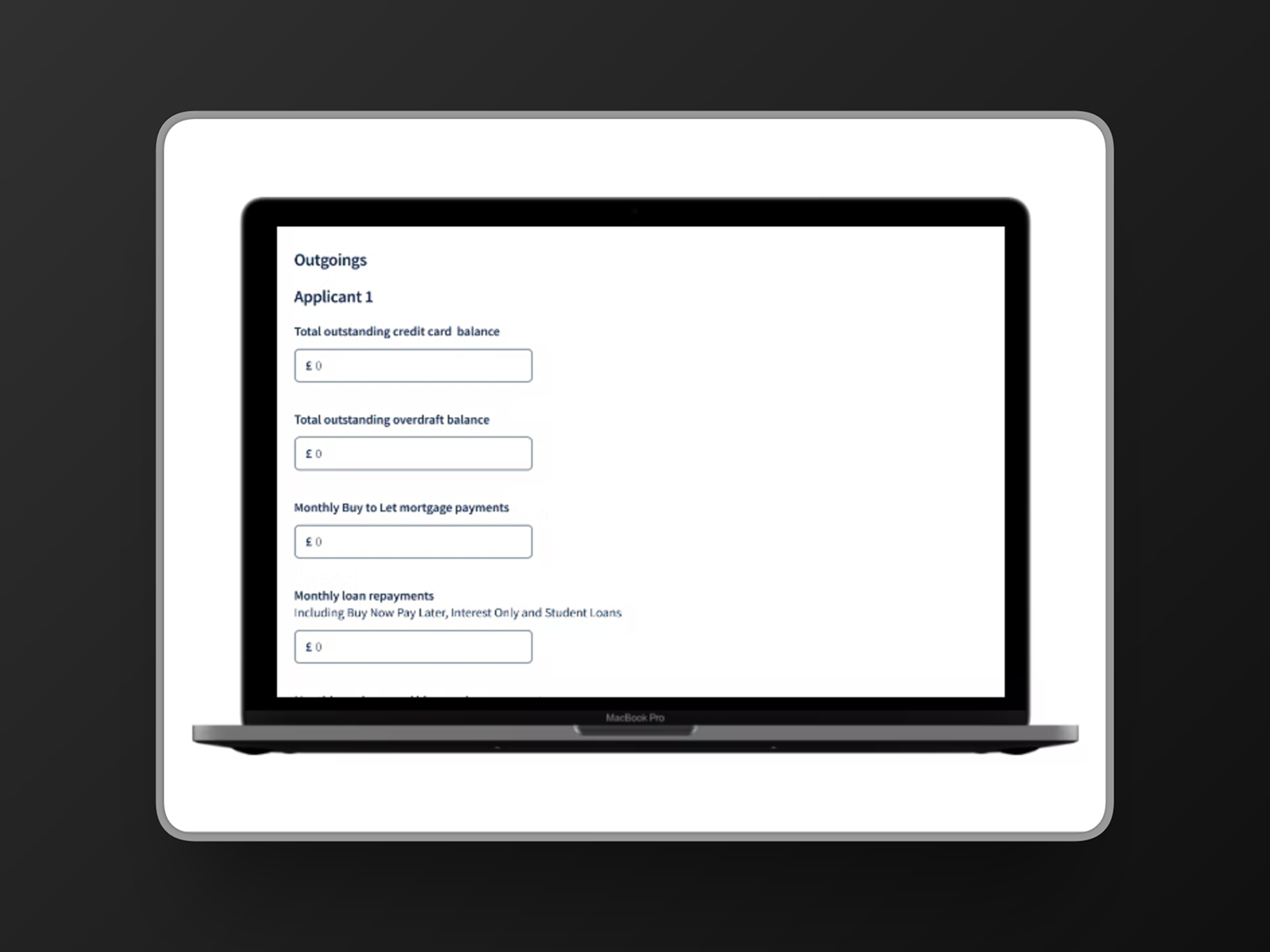
Before designing any screens, I worked with the Product Owner and Business Analysts to refine the question set - understanding what information was actually needed to generate accurate affordability results, and cutting what wasn't. This gave the design a stronger structural foundation and meant the prototype tested by brokers was already closer to what a final product would ask.
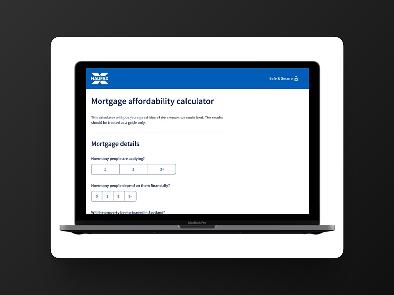
The initial design split the calculator into three distinct pages: Mortgage Details, Income, and Outgoings, with a Results page at the end. This approach felt logical from a design systems perspective - each section had a clear scope and a consistent layout. The prototype was built in Figma, iterated through crit sessions with the senior designer, and prepared for user testing.
User Testing
A dedicated user researcher ran five remote testing sessions with practising mortgage brokers. I was present for all sessions as a note-taker, and my observations fed directly into the synthesis. Before each session we prepared a FigJam board with screenshots of every page and space for notes below - one team member handled key notes per session, with others able to add observations afterwards. After all sessions, the notes were grouped into recurring themes.
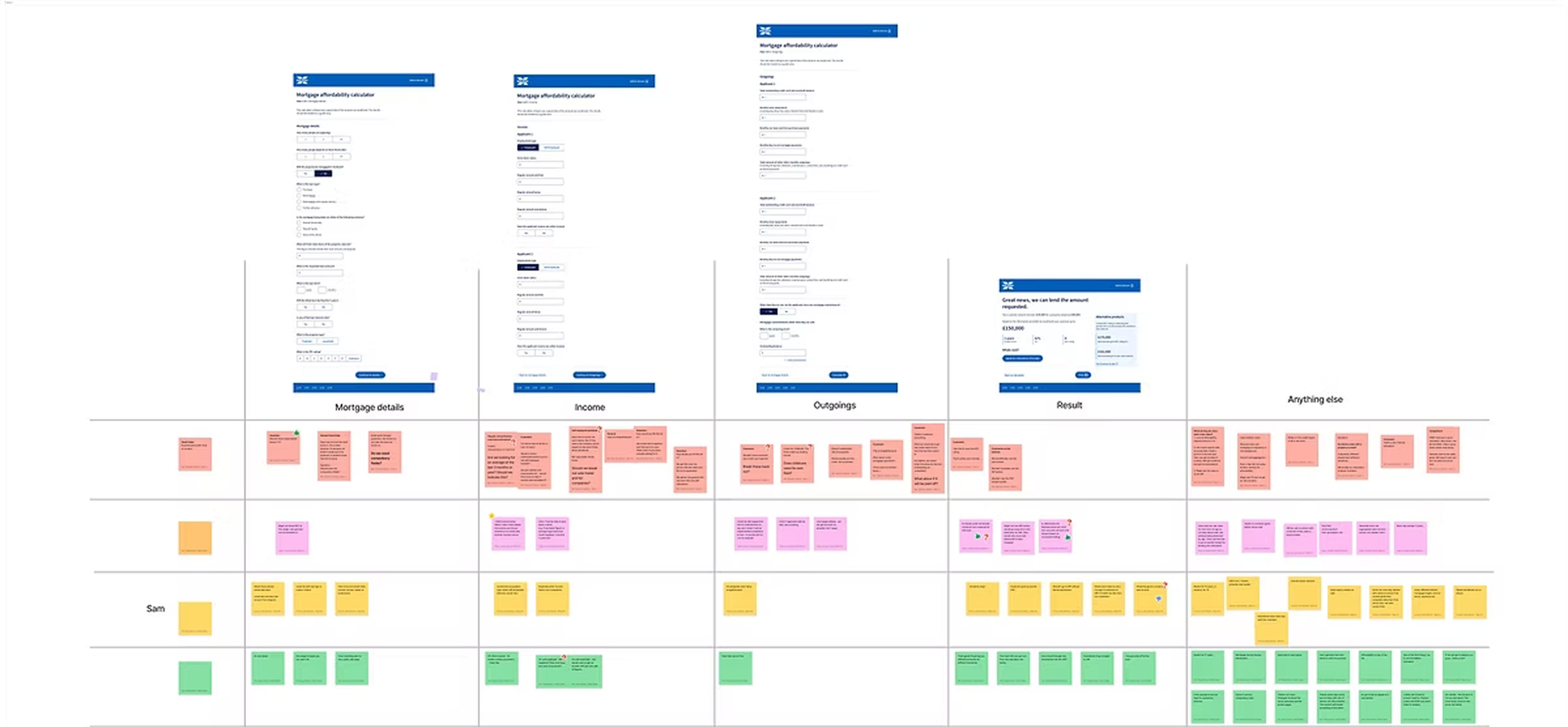
The key insights per section, along with the How Might We questions they generated:
Mortgage Details
Some brokers wanted additional context on criteria specific to Halifax. It wasn't always clear which fields were mandatory.
How might we make it clearer which fields are required? How might we provide guidance on Halifax-specific criteria?
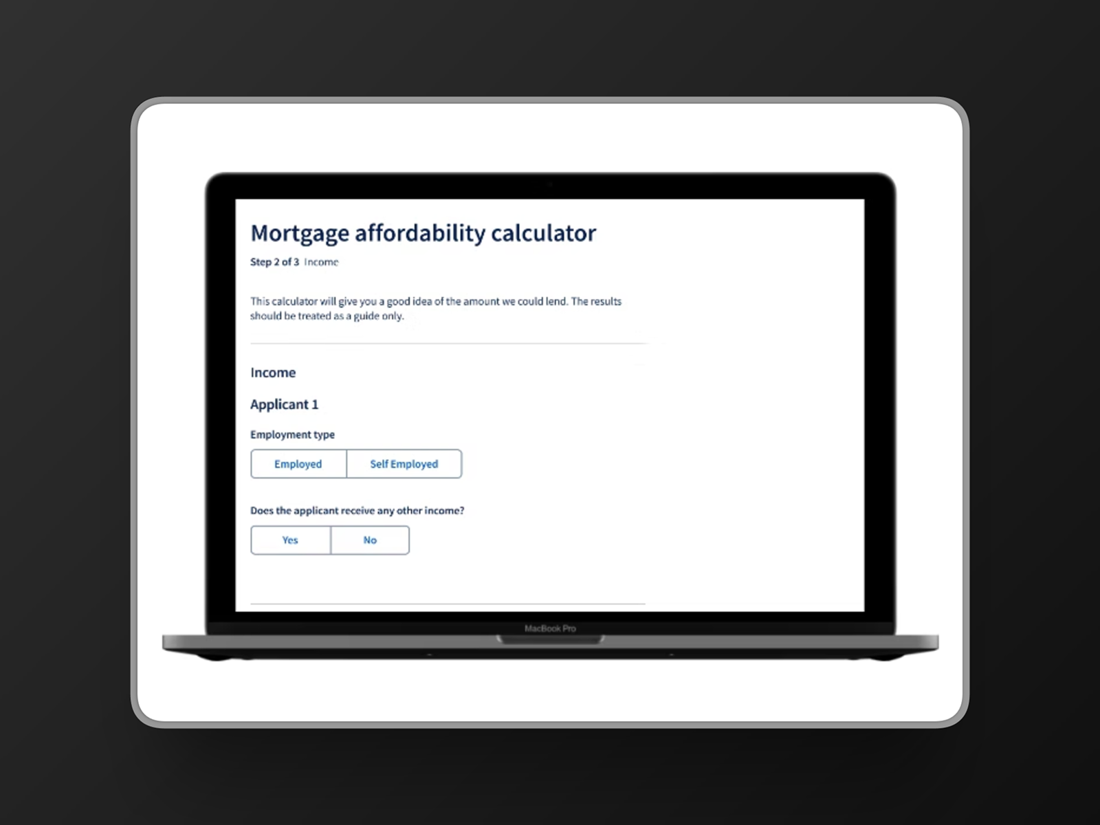
Income
Brokers were confused about which time period salary information was being collected over. The add income link was unclear in its purpose.
How might we make the other income section more intuitive?
Results
Most brokers said they wouldn't proceed to a mortgage application directly from this page. Several wanted to go back and adjust figures to see the impact on results - which the three-page structure made slow and cumbersome.
How might we make it easy to adjust key values from the results page?
General
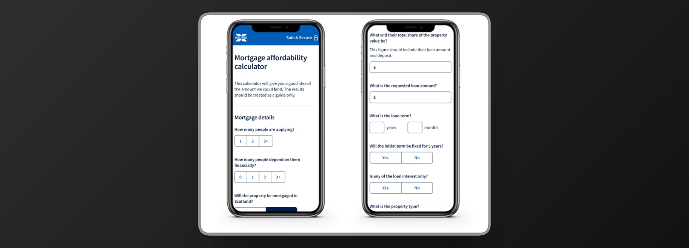
An unexpected finding: some brokers use the calculator on mobile when visiting clients face-to-face. The majority also preferred having the full calculator on one page rather than split across three steps.
How might we provide an optimal mobile experience? How might we show the whole calculator on one page?
Design Iterations
The testing produced two major design changes. Both were direct responses to what brokers told us - neither came from internal preference.
Single-page layout
The majority of brokers preferred having the full calculator on one page. The three-step structure we'd designed felt logical in isolation, but in practice brokers need to move fluidly between sections as they work through a client's situation - jumping back to adjust figures is a normal part of how they use this tool. Consolidating everything onto one scrollable page removed that friction.
Recalculation tool on the results page
Brokers told us they routinely go back and adjust key figures - loan amount, term, EPC rating - to explore how changes affect the result. Rather than requiring them to scroll up through the full form, I designed a recalculation panel directly on the results page, exposing only the key variables most likely to be adjusted. This keeps the broker in the results context and makes scenario exploration fast.
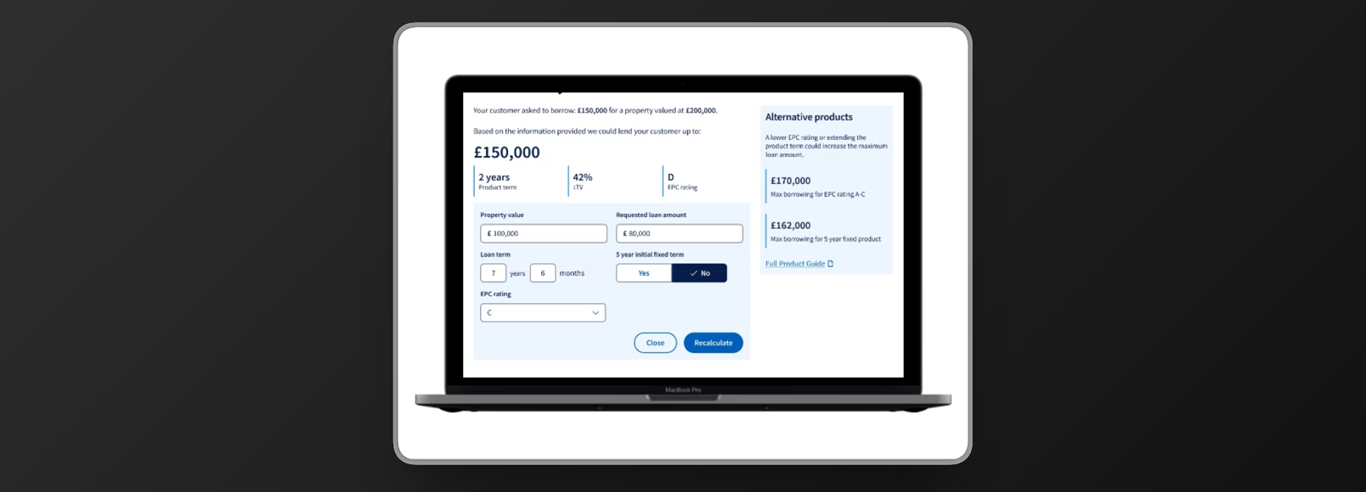
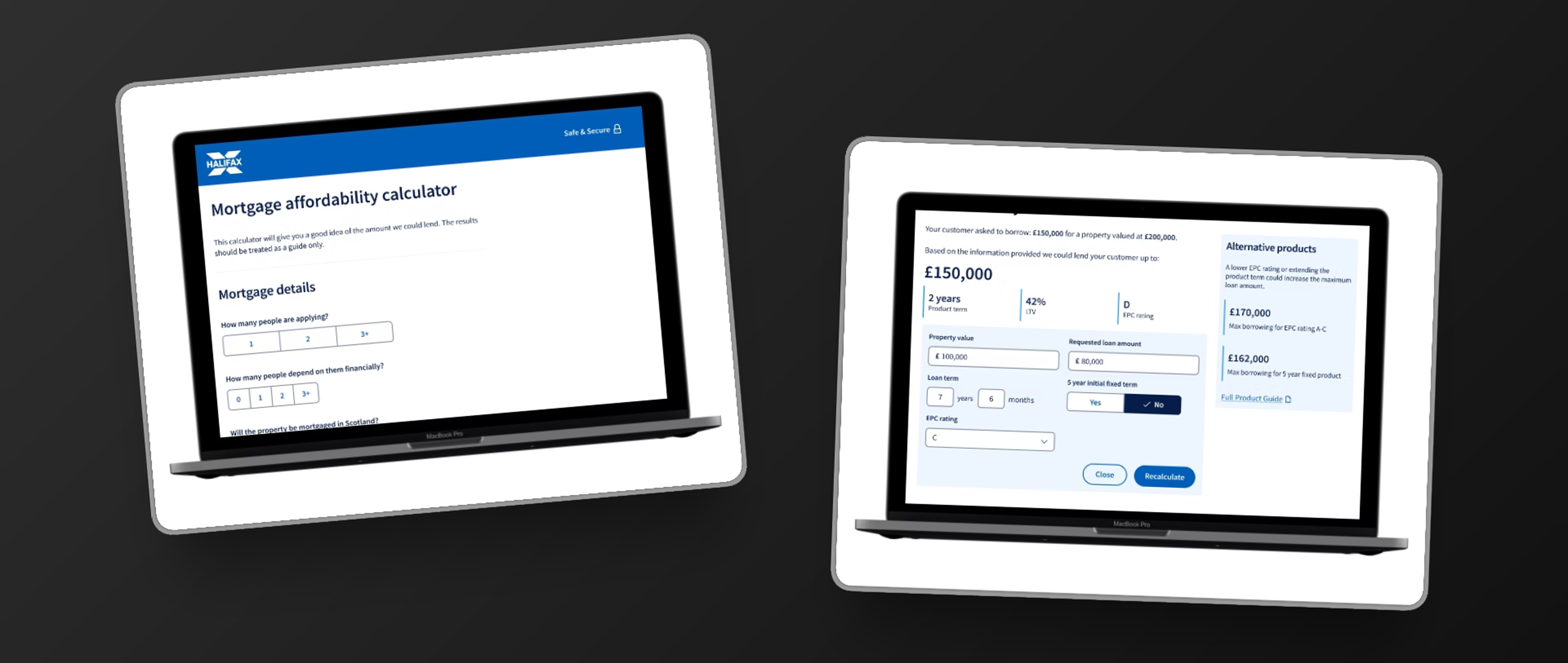
The Results Screen
The results page needed to do more than state a number. Brokers use this page as a starting point for a conversation with their client - so the design needed to show the headline result clearly, provide the supporting context a broker would need to explain it, and make alternative scenarios visible without being overwhelming.
The final design surfaces the maximum lending amount prominently, with product term, LTV, and EPC rating shown as secondary data points. An alternative products panel on the right shows what the figure could be under different conditions - giving brokers a way to demonstrate options to their client in the same view.

Looking Back
The mobile finding was the most instructive moment of the project. We had a clear assumption - brokers use a desktop tool in an office - and testing showed it was wrong for a meaningful proportion of users. That's a useful early lesson in what assumptions do to design: they feel like reasonable starting points until the evidence contradicts them.
The recalculation tool is the design decision I'm most satisfied with from this project. It wasn't in the original brief - it came directly from watching brokers try to navigate back through the form to adjust figures. Designing a feature that removes that friction entirely, and places it where it's actually needed, is the kind of problem that user testing surfaces and desk research doesn't.
I left LBG before the redesign shipped. The process produced validated, testable designs with clear rationale behind every decision - what happened after I left, I can't speak to.