
Overview
Loop is EE's design system, serving web and app products across 50+ components, patterns, styles, and service patterns. When the team needed to build a countdown timer component, it presented a well-known accessibility challenge. Countdown timers are among the most frequently mishandled UI patterns - commonly failing screen reader users and people with motion sensitivity in ways that are entirely avoidable.
Rather than building the component and fixing accessibility issues afterwards, I was involved from the start - ensuring both problems were understood, designed around, and solved before a single line of production code was written.
Two Problems, Not One
Countdown timers present two distinct accessibility challenges that are often conflated but require separate solutions. Getting this right meant treating them independently.
Screen reader announcements
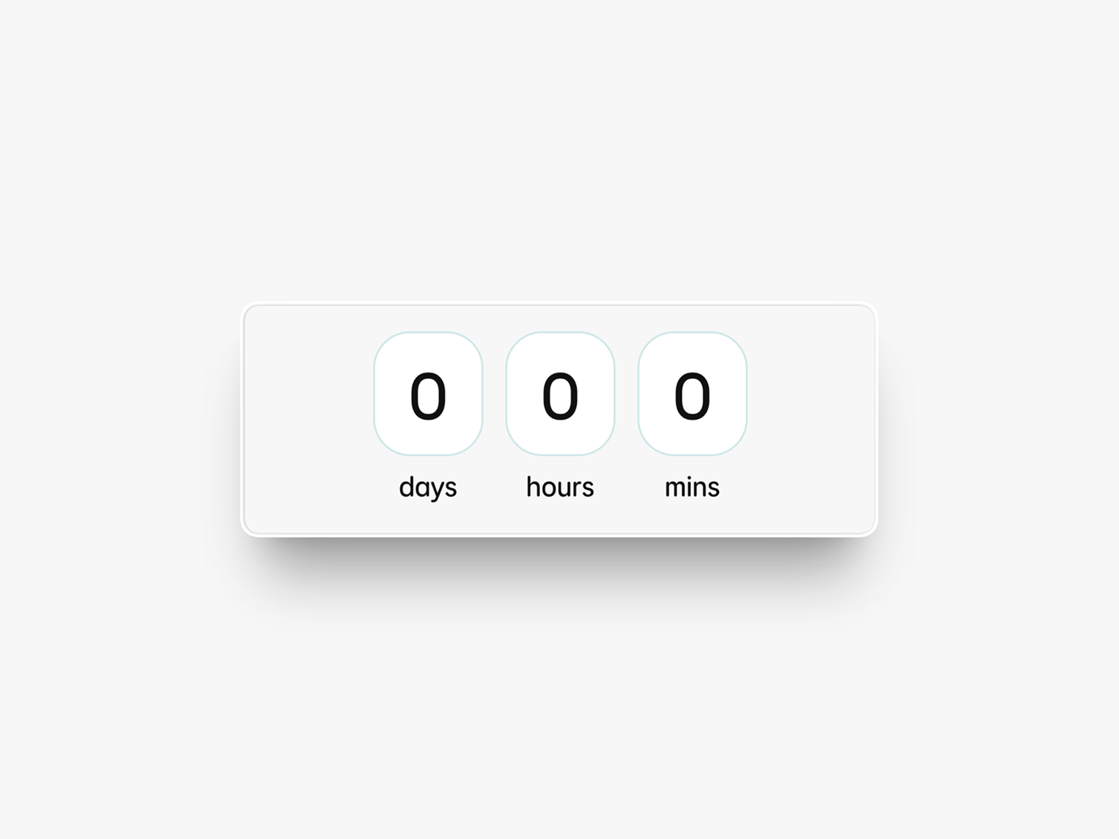
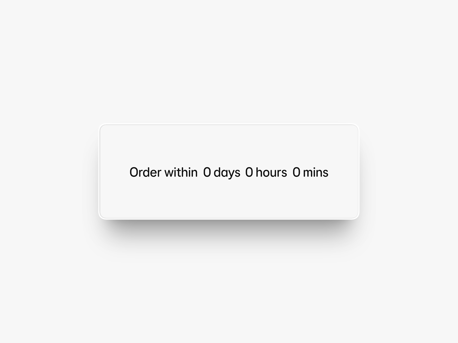
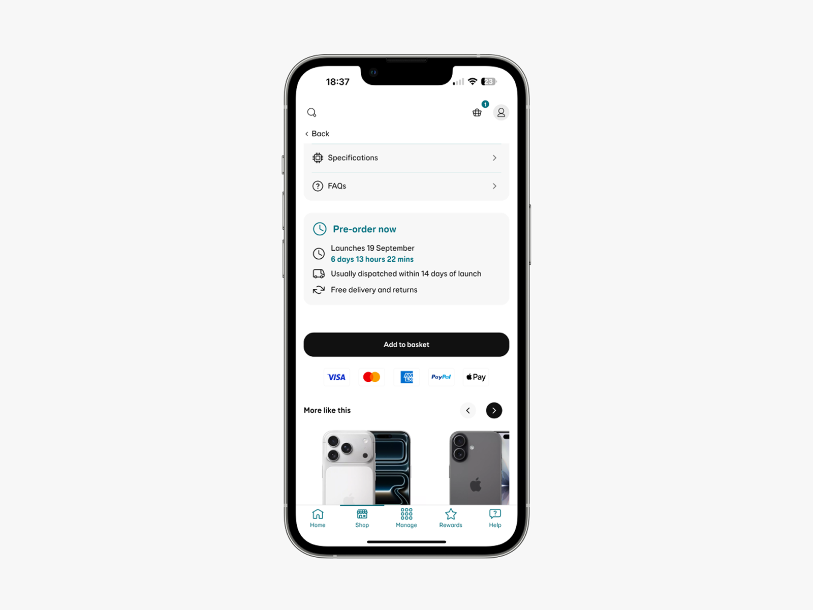
Timers typically either announce every second of elapsed time - creating a disruptive, unusable stream of audio - or announce nothing at all, leaving screen reader users with no awareness the timer exists.
Motion sensitivity
Auto-updating, moving content can be severely distracting or distressing for users with cognitive disabilities, attention deficits, or vestibular conditions. A ticking countdown is a textbook example.
WCAG SC 2.2.2 - Pause, Stop, Hide
The Approach
Shift-left accessibility
The most important decision was when to get involved - and the answer was from the very start. Accessibility retrofitted after a component is built is slower, more expensive, and often results in compromise. By working with the Loop team during the design phase, accessibility requirements shaped the component's behaviour from the ground up rather than constraining it at the end.
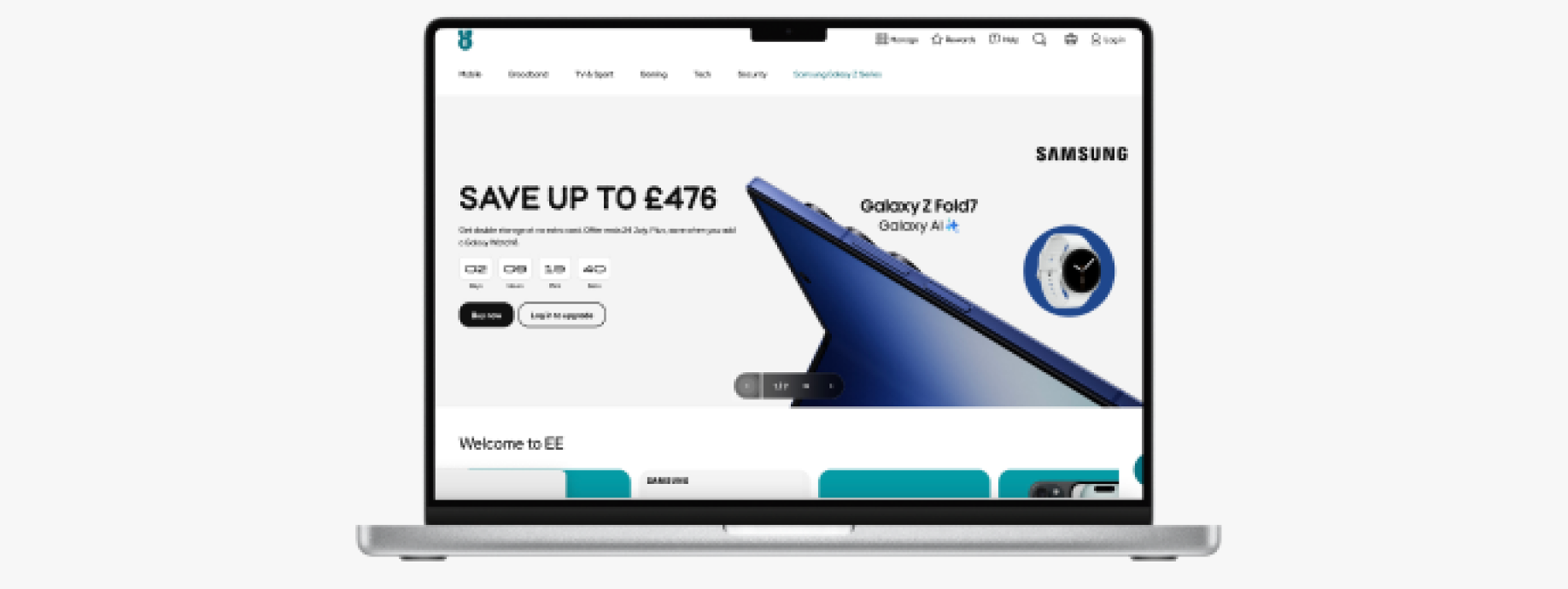
Because Loop components are used across EE's entire product ecosystem, getting accessibility right at this level scales automatically. One well-built component means every product that uses it inherits the correct behaviour.
Solving the motion problem
For WCAG SC 2.2.2, the team's initial instinct was a show/hide toggle - giving users a manual control within the UI to pause the animation. In practice, this didn't scale well. It added interface complexity, required consistent implementation across every context the component appeared in, and placed the burden on the user to find and use the control.
Considered and rejected
Show/hide toggle
A manual in-UI control to pause the animation. Didn't scale across contexts. Added interface complexity. Placed burden on the user.
Chosen approach
OS-level motion reduction
Honouring the user's existing prefers-reduced-motion setting on web and app. No additional UI, no user burden - respects a choice the user has already made.
By tapping into the built-in motion reduction settings available on both web and app platforms, the component automatically adapts to each user's existing system preferences. This approach is more robust, more respectful of user autonomy, and requires no additional interface complexity.
The Video
To communicate the work to the wider design and development community, I volunteered to create a three-minute explainer video for the Loop design system's quarterly newsletter. This wasn't a requirement of the role - I put my hand up for it because I felt the work deserved a wider audience and that a video would land better than written documentation alone.
I worked with the Loop team and contributing designers to ensure the content was clear and engaging. The video covers both accessibility problems and demonstrates the solutions - including the OS motion reduction behaviour in action.
The video features my blind colleague demonstrating how other countdown timers affect him as a real screen reader user - making the problem concrete in a way that technical documentation alone cannot.
Outcome
The component shipped without the screen reader and motion issues that affect most countdown timer implementations. By involving accessibility at the design stage, no retrofitting was needed - the correct behaviour was built in from the start.
The video reached 600+ colleagues across EE's design and development community via the quarterly Loop newsletter, raising awareness of accessible component design and demonstrating what a shift-left approach looks like in practice.
Looking Back
The shift-left approach worked well here because I had early access to the design team and a good working relationship with them. That isn't always guaranteed. The broader lesson is that accessibility integration at component level needs to be a standing part of design system process - not something that happens when a specialist happens to be involved. I'd like to see that formalised more broadly across design system teams.