Overview
This dissertation project set out to design an online portal addressing the specific challenges senior web users face when navigating complex financial products. Completed during the COVID-19 pandemic, it required adapting the entire research approach on the fly - replacing planned in-person methods with whatever could be done remotely and independently, without compromising the rigour of the output.
Working through an unprecedented set of constraints - no lab access, no in-person user recruitment, university support disrupted - the project became as much a test of resourcefulness as a design exercise. I made use of the expertise closest to me: my father, a financial planning specialist working with senior clients, provided domain knowledge on equity release and the needs of older users; and a partially sighted colleague from my placement year at Kirklees Council - where I had been working to the GDS Service Standard and GOV.UK Design System - had already introduced me to digital accessibility. The project received a First.
The Users
The portal was designed for equity release customers - a financial product exclusively available to those aged 55 and over, making the target demographic clearly defined. Equity release involves significant, long-term financial decisions, making clarity, trust, and accessibility not just desirable but essential. A confusing journey in this context doesn't just frustrate users - it could cost them money or cause them to disengage from a process they genuinely need.
Research
I began by writing problem statements to frame the design challenge before conducting research across several streams. COVID restrictions limited my options for primary research, but I made full use of the resources available.
Primary
Social media questionnaire
Distributed online to reach the target demographic within COVID restrictions. Surfaced specific wants, needs, and drop-off triggers.
Secondary
Industry and academic sources
Keys Market Monitor, Nielsen Norman Group usability study for seniors, Age UK digital inclusion evidence review, ONS internet usage data.
Competitive
Competitor analysis
Top three equity release providers reviewed for accessibility and usability gaps in their existing digital journeys.
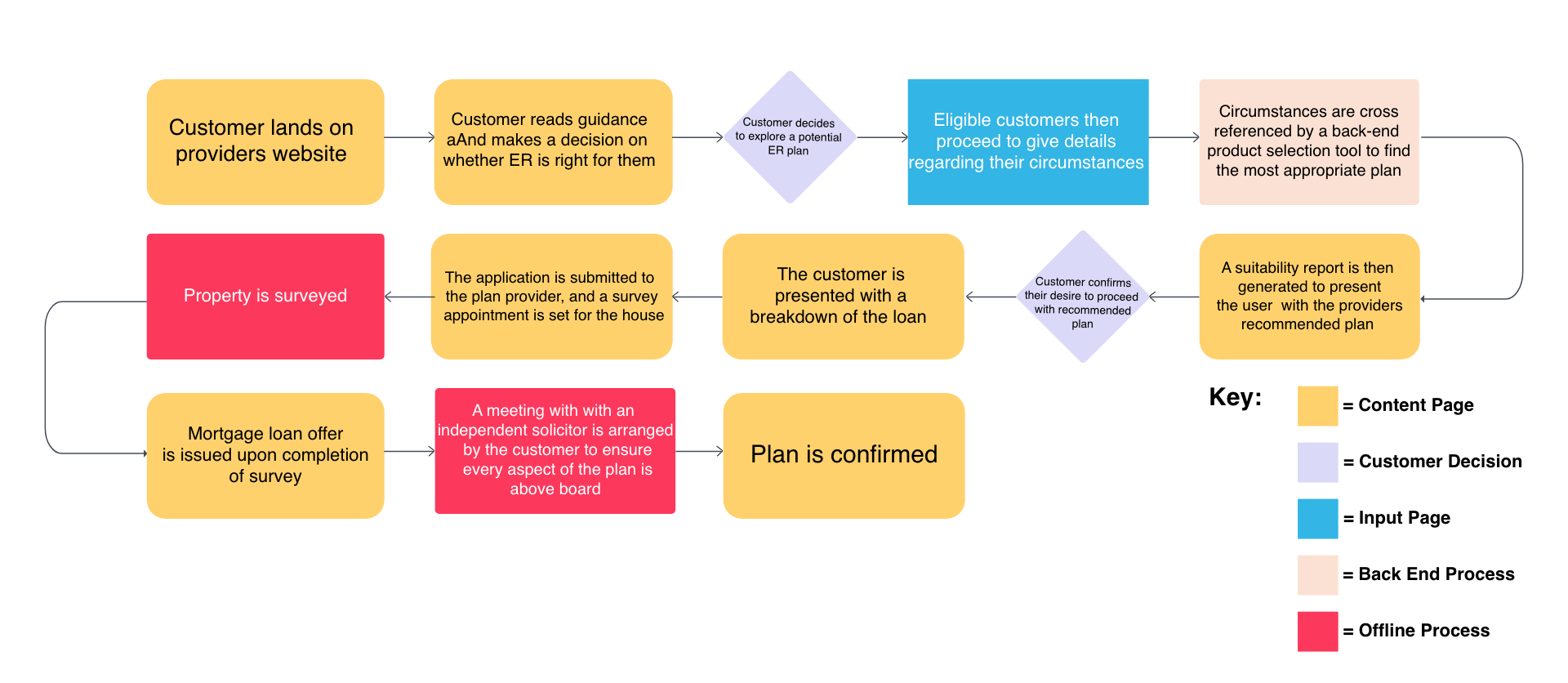
From the research I produced a flow diagram mapping every step a user would need to complete to navigate the equity release process, using a key to categorise interaction types. This gave the design a clear structural foundation before any visual decisions were made.
Design Decisions
I targeted WCAG AAA conformance - deliberately exceeding the AA standard typically required - on the basis that the user group's needs warranted a higher bar. Every key decision was made with the specific challenges of senior web users in mind.
Typography
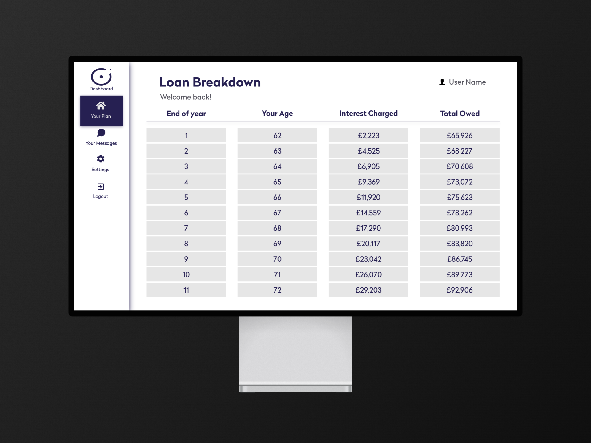
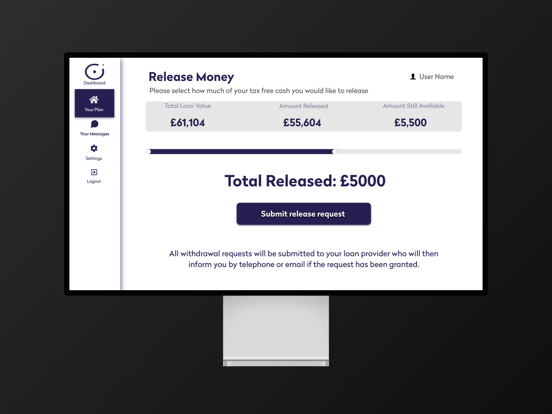
Minimum 20px font size
Larger type throughout to reduce the reading burden for users with reduced vision or unfamiliarity with dense digital interfaces.
WCAG AAAColour
High contrast throughout
All colour pairings selected to meet AAA contrast ratios, exceeding the 4.5:1 AA minimum for normal text.
7:1 ratioLayout
Dashboard navigation pattern
Key navigational steps kept persistently visible on screen, reducing the memory burden on users unfamiliar with complex digital flows.
Reduced cognitive loadStructure
Clearly delineated blocks
Strong visual separation between content areas to support users who struggle with dense or ambiguous page layouts.
Senior usability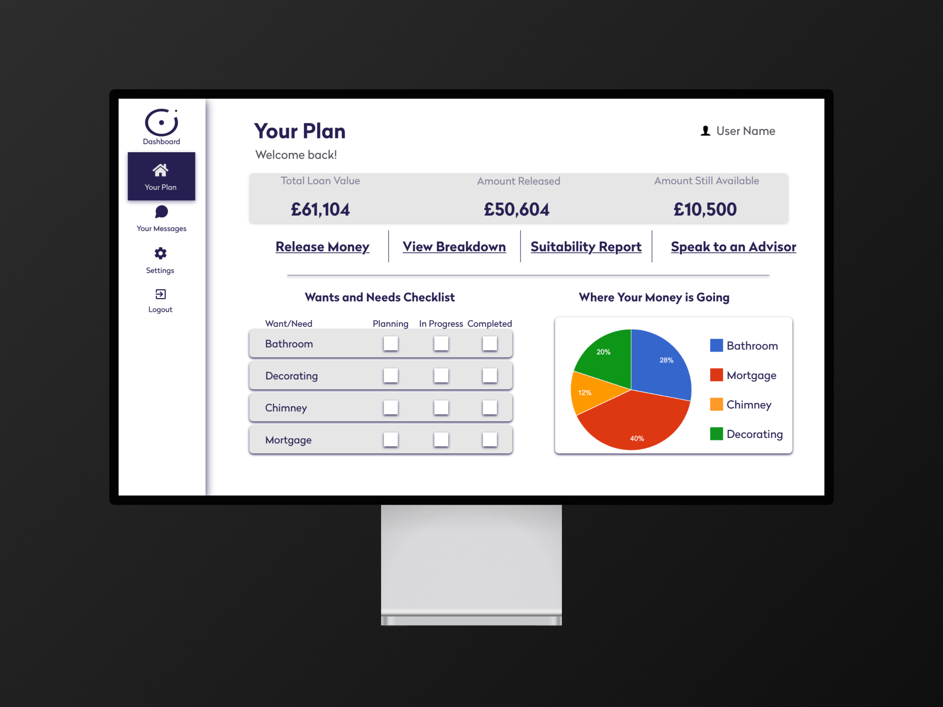
Testing
Usability testing with the target demographic was not possible. COVID restrictions made it unsafe to engage senior citizens in person, and the university's remote testing infrastructure wasn't available in time. Research was limited to the questionnaire data gathered earlier in the process.
This is an honest limitation of the project - and one worth naming directly. The design decisions were grounded in research and WCAG criteria, but they were not validated with real users aged 55+. It's a useful reminder that accessibility standards are a floor, not a ceiling - and that where it's possible to involve disabled users directly in the process, that involvement will always surface things that guidelines alone cannot.
Output
A fully interactive Adobe XD prototype with key interactions built in. The design achieves its accessibility targets - WCAG AAA colour contrast and typography standards throughout. The visual design reflects the constraints of the brief and the tool rather than my current aesthetic capabilities, but the accessibility foundations are sound.
Looking Back
With the professional accessibility experience I've gained since - including achieving RNIB Tried & Tested accreditation at EE - there are two things I'd approach differently.
First, rather than designing around accessibility constraints by manually increasing font sizes and contrast, I'd lean into OS-level user preferences - dark mode, system font scaling, motion reduction - respecting choices users have already made rather than overriding them with design decisions. This is exactly the approach I later applied to the EE Loop countdown component.
Second, I'd approach the project as a design system rather than a single product - a reusable accessible component library that could be licensed to any financial services company targeting this market, rather than a one-off portal design. The commercial opportunity in that framing is significant, particularly given the EAA now requiring accessibility compliance across organisations trading in Europe.