Overview
At The Sensible Group I worked as the sole designer across what functioned as an in-house agency, producing work for multiple business verticals simultaneously. The environment was fast-moving, with senior leadership that consistently prioritised speed over process. As the only designer I had to make pragmatic decisions about where to invest effort - and find ways to maintain quality and consistency without the usual scaffolding of a proper design process.
All builds were delivered in WordPress using Elementor, which shaped and constrained the design approach throughout. Despite this, I maintained WCAG AA standards wherever I had direct control - a personal commitment that ran counter to the organisational culture.
The Work
The five products spanned a wider range of sectors and visual styles than most designers encounter in a single role. Each brought its own constraints, audience, and visual requirements.
Financial Claims
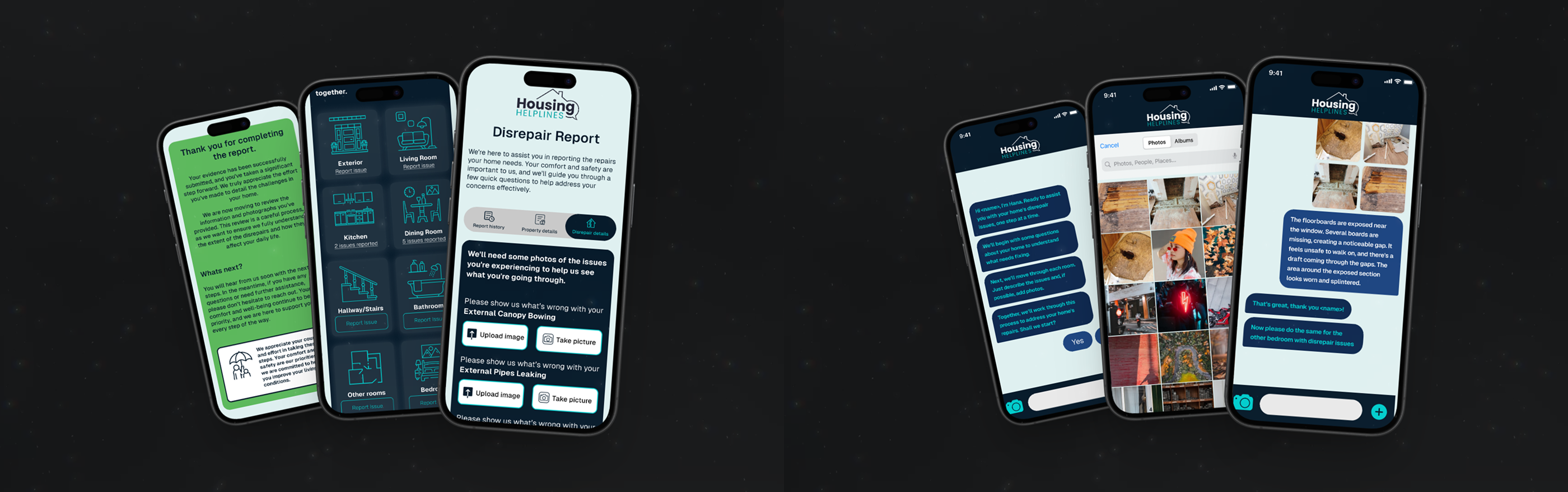
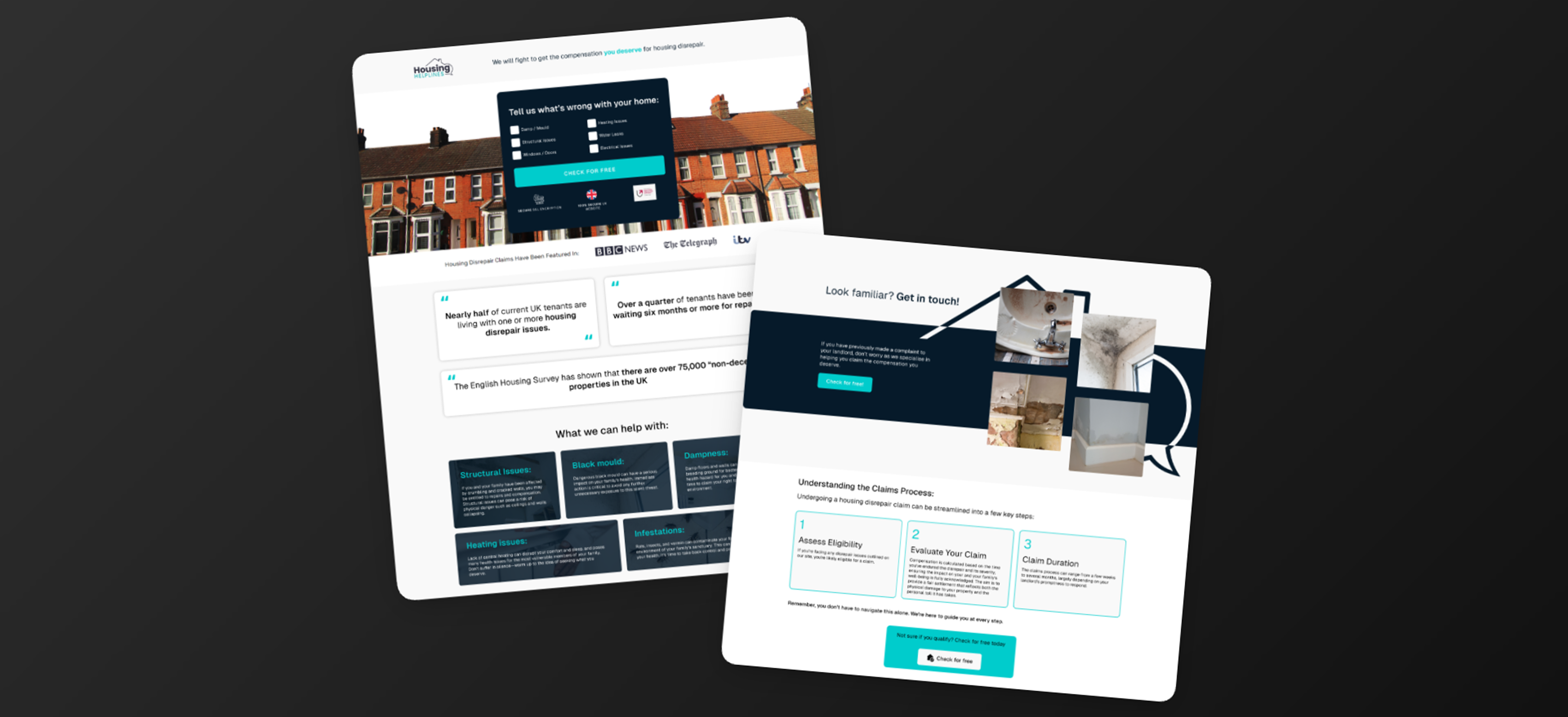
Housing Disrepair Claims
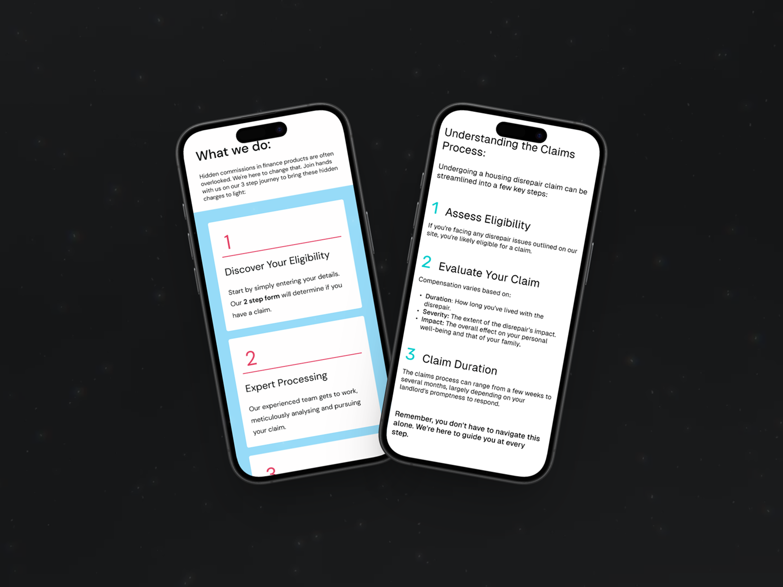
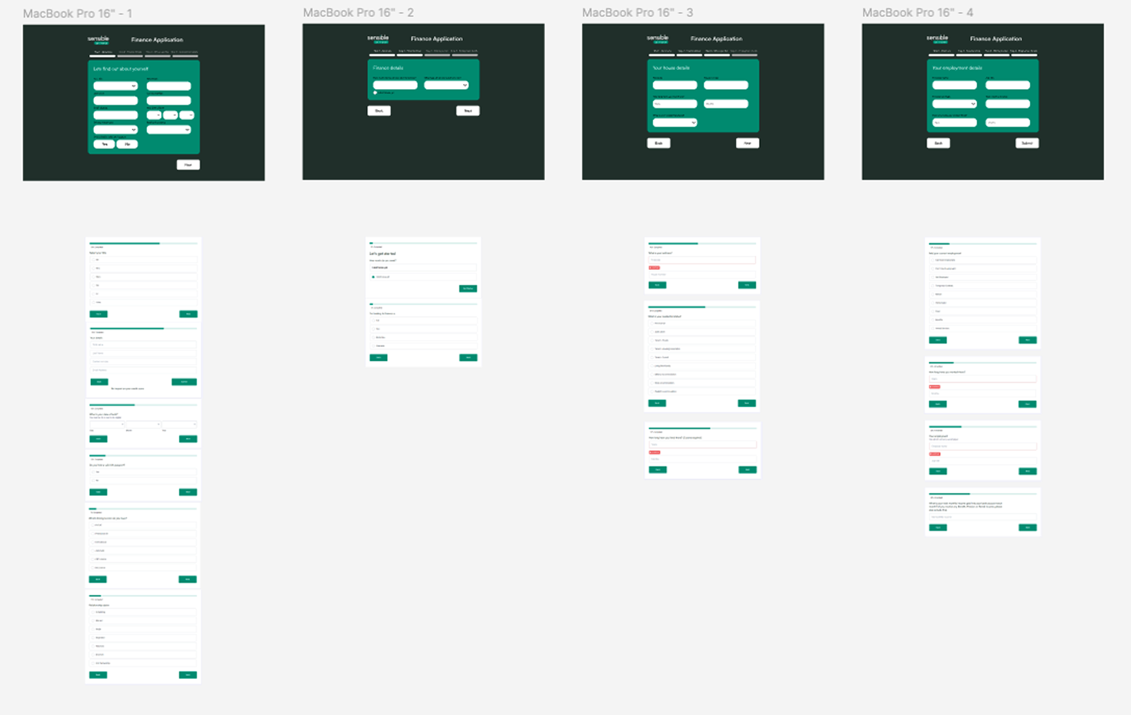
The most UX-intensive project in the set. I worked closely with the MD of the claims company to understand their business requirements, then used that alongside UX research to balance business and user needs in the form design.
Financial Claims
Financial Scams and Car Finance Claims
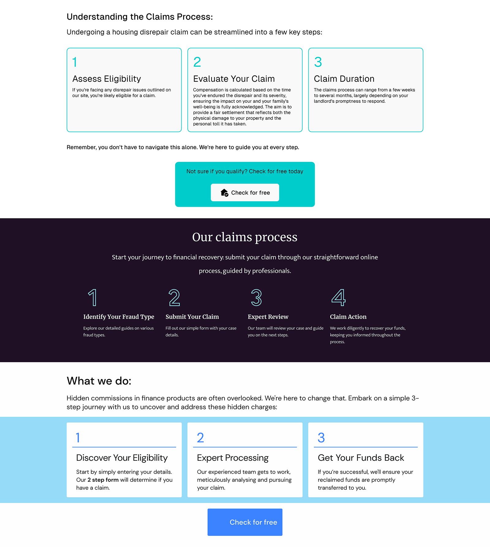
Part of a shared visual system across all three claims pages - a consistent design language built around trust, with reusable typography, structure, language and patterns that kept delivery efficient across multiple products.
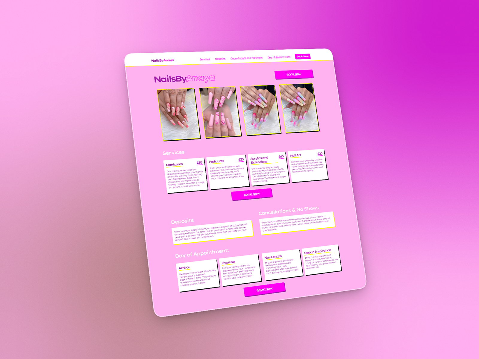
SME Client
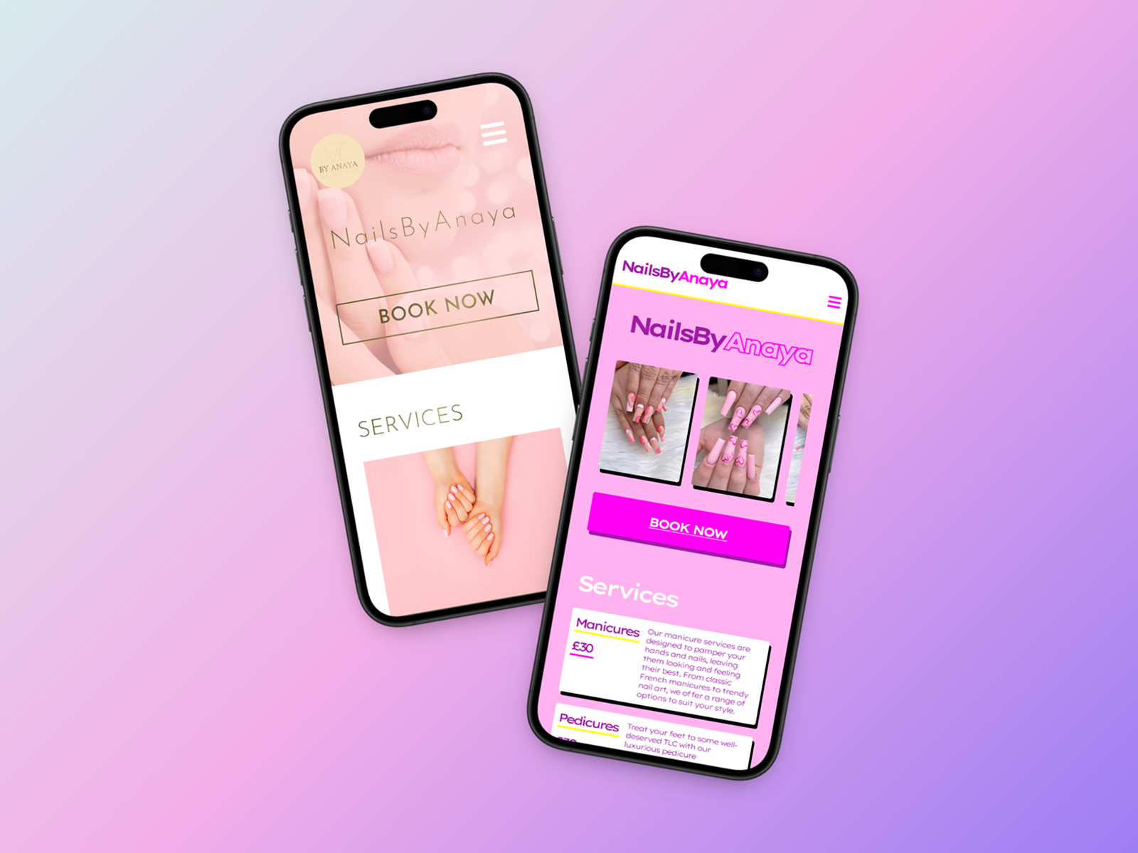
Nail Salon - Two Visual Directions
Two distinct directions: a neobrutalist concept with raw layouts and high visual contrast, and a traditional elegant aesthetic. The client chose the latter, but the neobrutalist exploration was a deliberate stretch outside my usual fintech work.
AI Product
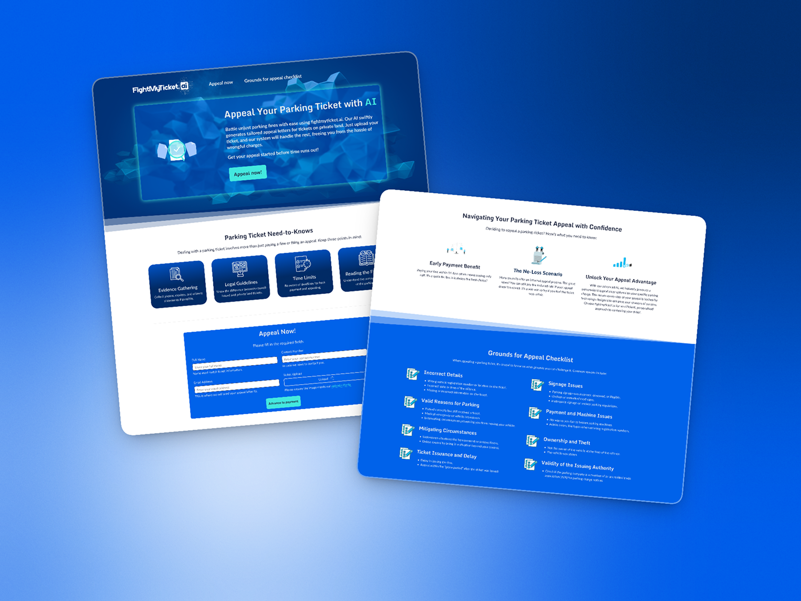
AI Parking Ticket Appeal Bot
A landing page for an AI-powered tool helping users appeal parking tickets. Required clear communication of how the tool worked and building user trust in an automated process - an early application of designing for AI-assisted products.
Financial Services
Car Finance Application Remap
Restructured the information architecture and form flow of an existing car finance application, improving the logic and sequencing of a complex multi-step process.
The Standout - Housing Disrepair Form
Of all five products, the housing disrepair claims journey involved the most substantive UX work. I started by sitting down with the MD of the claims company to understand exactly what information they needed to collect and why - then used that alongside UX research and demographic insight to find the overlap between business requirements and user needs.
Demographic research
Understanding who was most likely to be making a housing disrepair claim shaped every language and design decision. Research showed the most affected demographic was tenants aged 18-24, with 67% living with a disrepair issue, followed by the 35-44 age group at 52%. Local authority tenants (61%) were more likely to have issues than private renters (47%) or social housing renters (46%).
Research from the Human City Institute also highlighted that BAME communities face disproportionately higher levels of housing stress - more likely to live in overcrowded, inadequate, or fuel-poor housing, in older properties, and in homes with category 1 hazards. This gave me a clear picture of the audience: often young, often from a minority background, potentially distrustful of formal processes, and dealing with a stressful home situation. The language, tone, and structure of the form needed to reflect that directly.
Traditional form vs chatbot
For the Disrepair Report section - where users describe the issue in their own words - I designed two approaches: a traditional structured form and a chatbot interface. The chatbot approach was intended to feel more conversational and personal, lowering the barrier for users who might find a formal form intimidating or who simply communicate better in natural language.
Presenting both options to the team led them to explore a WhatsApp API integration as the final solution - allowing users to submit their disrepair report via a channel they already use and trust. That outcome was a direct result of the design exploration surfacing a better option than either of the original two. The business was already using WhatsApp for other use cases, meaning the integration saved over two weeks of development time compared to building a bespoke chatbot, and reduced cost significantly.
Key outcome
Design exploration led to a WhatsApp integration
By designing both a traditional form and a chatbot alternative, the team could see concretely that neither fully solved the problem. That conversation led to a WhatsApp API solution - a channel the target demographic already uses and trusts. As the business already had WhatsApp in use elsewhere, it also saved over two weeks of development work and reduced delivery cost significantly.
Systemic Thinking Without a System
With no formal design system in place and Elementor as the build constraint, I developed a shared approach across the claims pages - consistent typography, structure, language and patterns that could be reused across products. This wasn't a design system in the formal sense, but it was systems thinking applied pragmatically: build once, reuse intelligently, keep delivery moving.
I also ensured Figma components mapped to Elementor blocks on a one-to-one basis where possible, so page templates could be reused rather than rebuilt from scratch for each new product.
Working Environment
This was a high-context-switching environment driven by senior leadership that consistently prioritised speed of delivery over quality. As the sole designer I had to make pragmatic creative sacrifices - a real-world constraint that required judgement about where to invest effort and where to move quickly.
Despite the pace, I maintained WCAG AA standards wherever I had direct design control. Accessibility was not an organisational priority at The Sensible Group, but it remained a personal one.
Looking Back
The range of this work - from financial claims to an AI tool to a nail salon rebrand - is something I'm genuinely proud of. Adapting to completely different visual registers, audiences, and product types in a short space of time is a useful skill that doesn't get enough credit in portfolios that only show polished, long-horizon projects.
The AI parking ticket tool stands out in hindsight - designing a landing page for an AI-powered product in 2023 required thinking about user trust in automated decision-making that has since become a mainstream design consideration. That instinct for emerging technology, the same one that drew me to the LBG blockchain project, continues to shape how I approach new problem spaces.